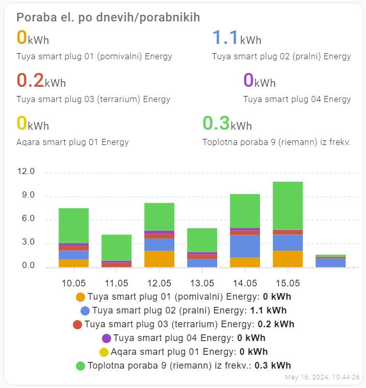
#TIL: stacked bar charts in #homeassistant
I wanted nice stacked charts to show my energy consumption in Home Assistant.
After combining #apexchart code from several sources (1), the result looks like this:
The code:
I’ve inserted ‘manual card‘ to the dashboardand inserted the yaml code:
header:
show: true
show_states: true
colorize_states: true
title: ***INSERT YOUR CHART TITLE***
type: custom:apexcharts-card
apex_config:
chart:
stacked: true
xaxis:
labels:
format: dd.MM
legend:
show: true
graph_span: 7d
span:
end: day
show:
last_updated: true
series:
- entity: sensor.tuya_smart_plug_01_energy
type: column
group_by:
func: diff
duration: 1d
start_with_last: true
- entity: sensor.***INSERT YOUR SENSOR 1 NAME***
type: column
group_by:
func: diff
duration: 1d
start_with_last: true
- entity: sensor.***INSERT YOUR SENSOR 2 NAME***
type: column
group_by:
func: diff
duration: 1d
start_with_last: true
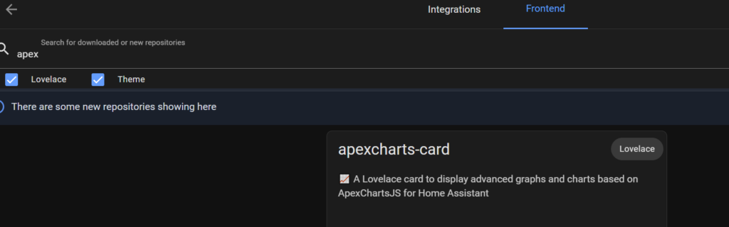
...Before using Apex charts in Home Assistant, install them via HACS or manually (search for apexcharts-card repository in HACS, frontend section):
Leave a Reply