Tag: til
-
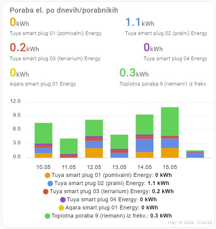
Nice stacked bar charts
#TIL: stacked bar charts in #homeassistant I wanted nice stacked charts to show my energy consumption in Home Assistant. After combining #apexchart code from several sources (1), the result looks like this: The code: I’ve inserted ‘manual card‘ to the dashboardand inserted the yaml code: Before using Apex charts in Home Assistant, install them via…
-
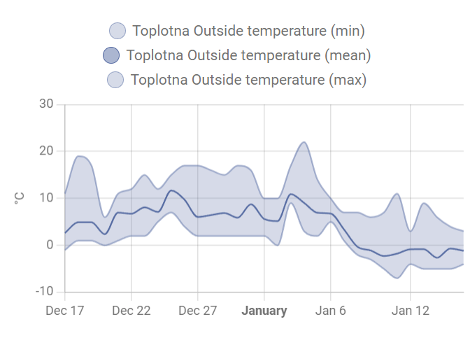
Home Assistant and nice statistics graphs
One of the things that bothered me in #homeassistant for more than a year was the following: I couldn’t figure out why some entities/sensors can draw nice longterm statistics graphs like this (with average, max, min values): and some show only bulky history charts (10 days of data) like this: #til Today I learned I…