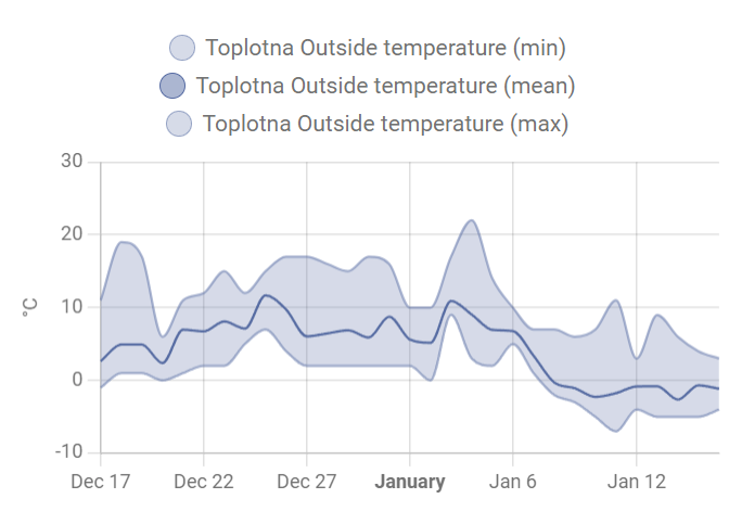
One of the things that bothered me in #homeassistant for more than a year was the following: I couldn’t figure out why some entities/sensors can draw nice longterm statistics graphs like this (with average, max, min values):
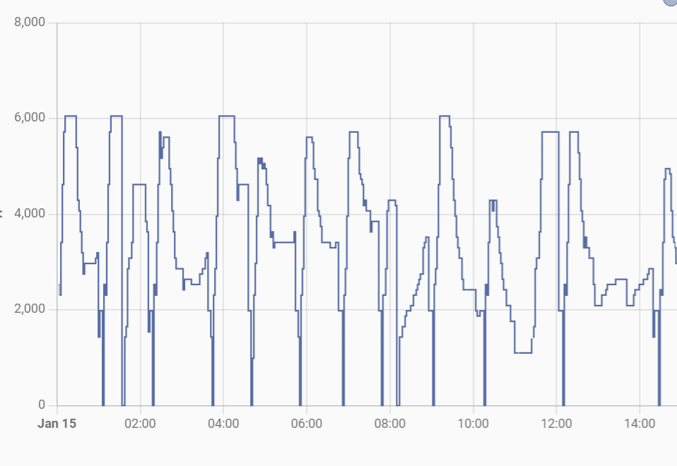
and some show only bulky history charts (10 days of data) like this:
#til Today I learned I have to add state_class: measurement to my template sensor definition in configuration.yaml.
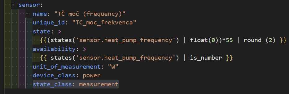
That’s it! After I added this line (which I took from some example), and restarted HA, the sensor started showing statistics charts.
Disclaimer: I’m an amateur who is tinkering with Home Assistant only now and then since 2021. I have some background in programming – Basic, Java, C, C++, Perl, Python. I was a full-time programmer for approx. 7 years in 00’s. Yes, I read the official Home Assistant docs several times and I just couldn’t figure it out. I don’t know why I couldn’t figure out such a simple thing. Maybe I already dumbed down, or is it age-related or the docs are not so explanatory…
Leave a Reply