Tag: apexchart
-
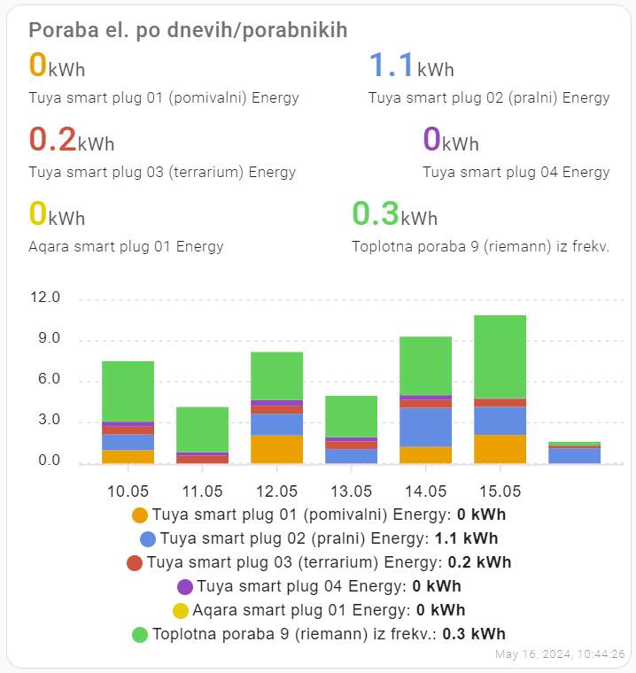
Nice stacked bar charts
#TIL: stacked bar charts in #homeassistant I wanted nice stacked charts to show my energy consumption in Home Assistant. After combining #apexchart code from several sources (1), the result looks like this: The code: I’ve inserted ‘manual card‘ to the dashboardand inserted the yaml code: Before using Apex charts in Home Assistant, install them via…